
~ model homes in Naples with a friend ~
Elisabeth - this one's for you.
Things to think about.
AFTER you have approved the architectural design - and maybe during - to speed up the process with them and the builder.
- Roof Material and color
- Front door design
- Inside door design
- Door handles / hardware color and design
- Trim out of windows
- Color of window trim outside (metal)
- Type of windows used - top / bottom or left/right
- Shower Fixtures - so they understand the plumbing
- Flooring
- Baseboards
- Crown molding
- Kitchen cabinet design
- Bathroom cabinets design
- Type of water heater
- Any water softener system
- Garage door design and color/stain/ material
- If there's cast stone on the outside design - color
- Dock design and pilings
When you get those done - then you move on to:
- Outdoor shutter design and color
- Granite, marble or composite granite (quartz). The last you don't have to mess with. The first 2 - have everything sealed properly.
- Kitchen Appliances - so they know electrical and plumbing
- All sink fixtures, toilet rolls and towel rods.
- Glass shower surrounds and handles
- Lanai tiles
- Front door tiles and outside all side doors stoops.
- Pool tiles / finishes
- Metal on the house and fencing
- Gutter color and placement
- Paint and stain colors - inside and out
- Bathroom tiles and grout color. Make sure things are caulked and sealed.
- Backsplash
- Light Fixtures
- All drawer handles: kitchen, bath, everywhere
- Landscaping design - irrigation pattern
- Landscape lighting
- Driveway pavers
- Where the gas tank is located - and there are requirements
- Security system and cameras
- Home Sound System and network set-up. We hardly use it.
- Garage set up, if any, and color of floor.
Inspiration:
I'm sure I've forgotten something.... but this will keep you busy enough.
Below are exteriors we saw while bike riding on an obviously beautiful day.

Lovely simple design. The front door has about 4 steps - and garage at ground level to achieve flood elevation requirements in that area.

Traditional window treatment - with multiple pane design and Louvered shutters.
Brackets in wood stain to match the front door.
Gray flat tile and gray paver driveway.


Hardie board exterior with light gray metal room. All trim work is also white.


Brackets and shutters are the same color. Too much....not the norm.
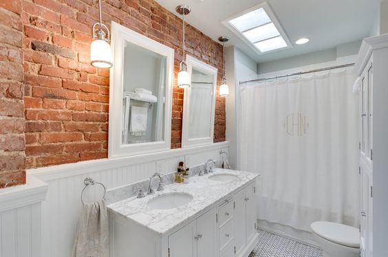
Below starts photos taken from the open houses we attended. What great way to have food for thought.


I think this was a sample of tile that looked like wood. They used porcelain in the living room and these in the study and master bedroom. This was amazing lower end product in a $3M home.


This shower accent had to be thought about before they finished the walls.
You may not feel the same way - but I like privacy when I take a shower. So we have a small door that is frosted in the middle. Guest showers - I wish I had built at least a pony wall to give privacy. Food for Thought.
I also like somewhat enclosed showers - so the steam stays in.


Wine room - OMG!

Porcelain tile.
I would design he Washer/ Dryer sitting on another unit that lifts them up - it makes for less bending over.

With tall ceilings - the tile went up there as well and a window to bring in light. This shower closure is very cool - but I think there may be a price tag that goes with it.

This just lacks.....

I think this is too much - to the walls.


Look what happens to just a hallway with 12 foot ceilings.

Large wine room behind the glass. Get to it from the back hallway.


A little added extra in the tray cut out with some small beams and beadboard wood.

My tray in the LR - just some of the same crown molding to square it off.

The house has 10 foot ceilings downstairs and upstairs except for the LR area. My home has 10 - 10.5 for the beams and 9 foot upstairs. It's cozy and money savings.

I like how the dining room is off to the side - and near the lanai - and not in the middle of the room between the LR and kitchen - or off in the front of the house.


Very basic baseboards - and I feel too basic.
You can see the cabinets are more traditional with the molding - so the baseboards are not matching but they are cutting costs.


outdoor ceilings

Tiled fireplaces are less expensive material than stone - and they create a more contemporary finish. But I don't feel this outdoor room feels Floridan or Beachy - it leaves me bored.

Indoor vaulted ceilings

Built in Bench

These are very detailed cabinets above and below.
Note the horizontal tile design.
Great laundry room - if your lucky enough to get this size. Mine is very small (I actually had to stack my W/D to make it work) and not much counter space - so I brought in a small table.

MINE
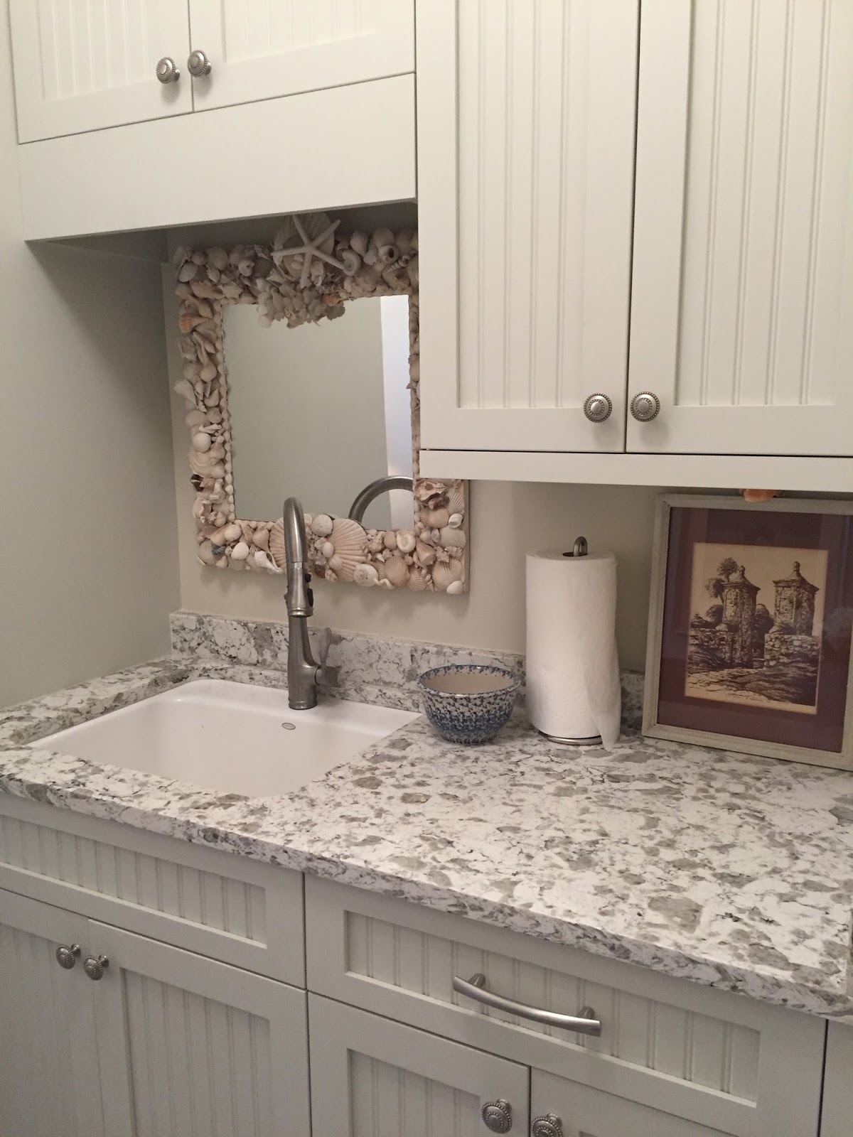
Extra deep sink comes in handy. Because of the dogs and my painting - I should have added a garbage disposal - but I have a sprayer faucet.

Matte silver knobs. Hardware stays consistent throughout the house on door knobs and hinges. You can change in the baths and kitchen according on your colors and mood created.


Metal edging because this basket weave tile doesn't have bullnose edges. Done on soap insets and outer shower edges. This is also used as a decorative accent between the larger porcelain tile an the decorative basket weave.

Sound System only. We just use our Echo....

When a home has to go up for elevation - so does the front entrance. The garages will be at street level - and there will be a slight grade upward to achieve it. You combine the 2 elevations to achieve your finished need - and so nothing is too drastic. You do NOT want a Stilt home.

A step up countertop. it hides the work area from the living room!!!
These are probably 12 foot ceilings - and they're trying to fill the gap in the kitchen. Just think of the rest of the house - how much empty space is up there? That's why they may do some architectural interest on the ceiling to draw your eye upward. Just more overhead in $$ as well.


Many homes are using large porcelain tiles on the shower walls with an accent strip either horizontal or vertical. Using the larger tile - is less labor intense. Smaller tiles are used on the floor to make it safe.


Herringbone pattern. You can use the same tile - and change the pattern design in several rooms. This way, oblong, square, random...

The tiler - will add the cubby holes for soap. You need to know where to have them located and how many. Usually located between studs to make it easier. These have bull nose tiles for a finished look.
If you go horizontal - they will have to build the wall to accommodate.

You could use a small bathtub in a guest bathroom for grandkids. Comes in handy.


Another simple window casing.


Tub surround instead of free standing under a window.


Doors and baseboards. Do not like these baseboards.


Simple miter on the edges.


This is a nice simple window trim out.
Wait for it.....

This is mine - and they never asked! Over kill. I have about 20 windows and doors. Think of the labor this cost. Never approved. And you wonder why I had overages.

I like the sliding doors vs French doors. You can use a screen although there isn't one here. French doors open wide when needed - for some difficult furniture.


This is my crown molding.


This may be 11 foot ceilings. If the doors are 8 feet - looks like 3 feet above. What's also nice is that the kitchen cabinets work their way to the ceiling and are not 'floating' somewhere in between.


These are my baseboards. A traditional look.


Light switches - with a dimmer on one. Most homes were showing these type of switches. Don't use what we have - it drives me CRAZY.

This is one of my light switches. I have to memorize the order because without my glasses I can't read it.

Here's another - but they never came back to put on proper labeling so the chap scotch tape is still holding the paper in place.

This is one in my dining room. Frankly - the kitchen could be located in the kitchen and the bar in the bar. That would leave 2-3 switches only for the Dining Room with a dimmer switch. What's wrong with that?

Door design and baseboard. Small bead design in the shaker square.

I have 5 panel doors (these are mine). Now, think of the labor if they added another piece of molding on the inside of each - times the amount of doors I have in this house. That's why some of this stays simplistic.

Instead, I added the Shaker style heading to each door. Many on the windows are covered by draperies - but the look had to stay consistent. This also repeats the look on the kitchen cabinets.

tile on the edges instead of horizontal.

Gray tile roof - gray paver driveway - clean lines

Precast window sills
but also here are the windows that open - top to bottom - not side to side.

12 foot ceilings - creates too much empty space above the kitchen cabinets.

OAK FLOORS

Simple window trim work - not fuzzy and not labor intense.


bump out ceiling - straight lines - no crown molding

His and Hers - but the warm mist created is escaping.


You don't have to put in a built in bench. It may be cute and more economical to put in a free standing stool - or garden stool. I have it in all of my showers.

Mirror is surrounded with molding and the lights are floating inside.


Love the concept of top and bottom windows. This way a window screen can be attached to the outside - and the window can be opened to let in breezes and not bugs. This is like a Northern design. Windows that move in and out - because of code the windows have to move outward - meaning the screens are showing on the inside. That's not pretty.


Simple decorative wainscoting - but not done very well. You shouldn't see the seams.


Comments
Post a Comment