
GROUT LINES
The color of your grout can make or break the look of your tile. The grout color can create different effects or visually blend away.
 Another Chart From Home Depot


Don't go for the darkest shades because it would look darker on the actual grout. I went with Pewter and it turned out looking more like Charcoal. Lets say if you are thinking Charcoal, just dial back a few shades.
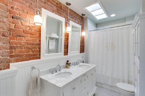
MASTER BATH
I'm keeping the grout on a lighter side - so that the dark tiles don't come off too heavy.
All the bathroom tiles have a khaki tone ~ meaning there's green in the gray and not blue.


Home Depot Cape Gray #546
But problem is they don't have it in stock at HD. So I took a trip to Lowe's.

It's a good alternative. I don't want to go too dark.
MASTER SHOWER NICHE

Grey slab on the bottom - subway tiles on the sides - grey metal on the edge and penny tile backing.
Then LOADS and LOADS of white subway to pop all the gray.

ON THE WHITE SUBWAY TILE
I don't want to see the grout - The tiles may be an off white - match the grout to the tile.
CLEAN and BRIGHT
I don't know if Bright White matches the tile ~ I have to go back to the store.
The tiles from Lowe's have ever a slight cream cast. They are not a bright white - but they are not antique either. The BRIGHT WHITE grout from Home Depot will match.
It will look something like this:


Laundry Room
I don't know if Bright White matches the tile ~ I have to go back to the store.
The tiles from Lowe's have ever a slight cream cast. They are not a bright white - but they are not antique either. The BRIGHT WHITE grout from Home Depot will match.
It will look something like this:


Laundry Room

I also want the grout lighter because of the dark pebble tiles. It will keep it toned down - there are a lot of cream and it won't be such a contrast.
POWDER ROOM
The small room was done with a retro look of terrazzo. It's a monochromatic back drop for the other items in the room.

MY SAMPLE
My samples are a different hue - than the photo. There's some tans and light grays.


Home Depot Natural Gray #09
It has a Khaki tone to it - but so does my tile sample because there are brown undertones. This is in stock so we're in luck. We are using non sanded grout. The lines are very thin.


GUEST BATH

Just cut the 12" penny tile mat - to 6" and run that around the top with a back pencil tile on both sides for a finished look.


I'm not doing black grout ~ it's just too strong a color. I'm using a dark dove gray grout lines on everything. Keep the lines very thin very thin on the subway tiles so that the lines are not overpowering. The gray will also pop the black shiny penny tile accent around the top of the bathtub.

We can't get the Dove Gray - So I'm switching to Pewter. It's the next color down - and I think from the Internet photos - it will still look gray. HD - and you can also see the Natural Gray we are using in the Powder room in the chart above.

This is a photo when I searched around for the Pewter - it looks deep enough.
The different between sanded and non sanded grout are sanded is for spacing larger than 1/8". Since my tile spacing is the smallest, we are using non sanded grout. I don't prefer the sanded grout because it's so bumpy and always hard to clean.

See - it still looks gray.
Then Lots and Lots of gold fixtures - faucets, mirror, towel racks...

WE NEED A LOT OF WHITE IN THIS HOUSE.
We have to make sure it doesn't get too dark with our vanity and tile choices.


Comments
Post a Comment